Let’s face it, friends. A website that looks like it was built in 1999 isn’t going to win any hearts (or conversions). But fear not! Today, I will delve into the world of website aesthetics, where I’ll give you some tips on how to make that website pretty.
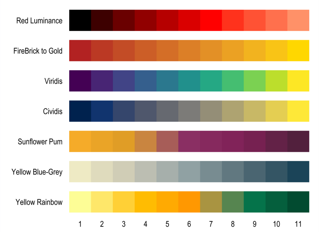
Step 1: Color is your friend (But don’t do the most)

Colors set the mood, just like that perfect song on a road trip. Choose a palette that reflects your brand and resonates with your audience. Think calming blues for a yoga studio, vibrant oranges for a kids’ toy store, or sleek blacks for a photography showcase. But remember, restraint is key! Nobody wants a migraine from a color attack.
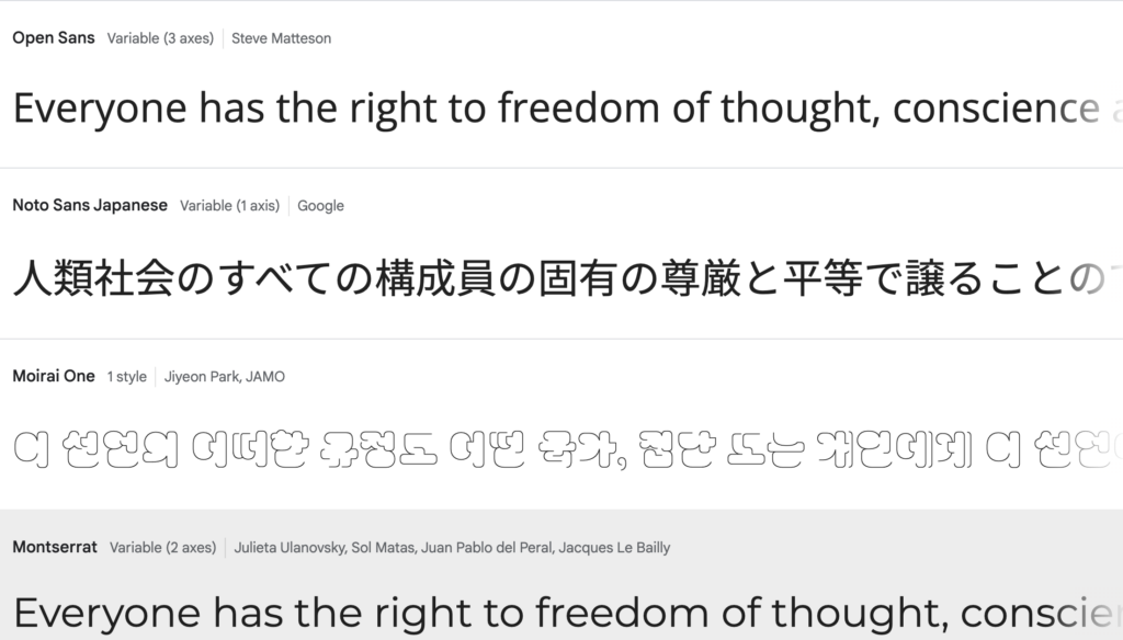
Step 2: Fonts: From Friend to Foe (Choose Wisely!)

The font you choose is the voice of your website. Do you want to whisper elegance with a classic serif? Shout boldness with a quirky handwritten style. Or maybe strike a balance with a modern sans-serif? Remember, consistency is king (or queen) – pick a font family and stick to it (except maybe for playful accents). My hands down favorite font is Montserrat.
Step 3: Images: Show, Don’t Tell (And Show Stunning Stuff!)

A picture is worth a thousand pixels, as they say. Ditch the blurry stock photos and low-quality pics and invest in high-quality visuals that complement your content. Showcase your products in action, capture the essence of your brand, or simply make people giggle with funny dog memes (it’s a judgment-free zone here). You can find good quality stock photos on sites like pixabay or unsplash.com
Step 4: Less is More (and White Space is Your Friend)
Don’t cram everything onto your website like a Tetris master on steroids. Give your content room to breathe with generous white space. Think of it as the pause between notes in a beautiful song – it adds emphasis and prevents visual overload.
Step 5: Call to Action: Make it Obvious (and Irresistible!)
Don’t leave your visitors wandering like lost puppies. Guide them towards your ultimate goal with clear and compelling calls to action. Buttons that pop, text that sings, and colors that call – make it impossible to resist taking the next step!
Bonus Tip: Mobile Matters!
Remember, most people are surfing the web on their phones these days. Make sure your website is mobile-friendly and looks just as stunning on a tiny screen as it does on a giant monitor.
Now go forth and focus on how you want to make your website pretty. Reach out when you are ready for me to create your WordPress website.
