by Olivia Moore | Jan 23, 2024 | Web Design
Let’s face it, friends. A website that looks like it was built in 1999 isn’t going to win any hearts (or conversions). But fear not! Today, I will delve into the world of website aesthetics, where I’ll give you some tips on how to make that website pretty.
Step 1: Color is your friend (But don’t do the most)

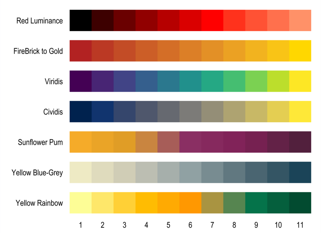
Colors set the mood, just like that perfect song on a road trip. Choose a palette that reflects your brand and resonates with your audience. Think calming blues for a yoga studio, vibrant oranges for a kids’ toy store, or sleek blacks for a photography showcase. But remember, restraint is key! Nobody wants a migraine from a color attack.
Step 2: Fonts: From Friend to Foe (Choose Wisely!)

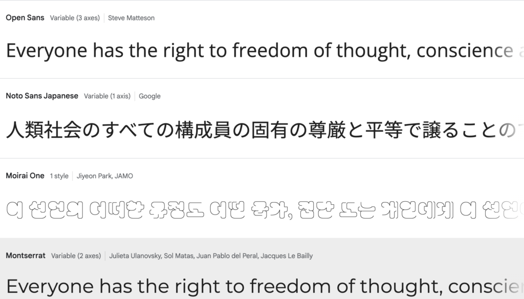
The font you choose is the voice of your website. Do you want to whisper elegance with a classic serif? Shout boldness with a quirky handwritten style. Or maybe strike a balance with a modern sans-serif? Remember, consistency is king (or queen) – pick a font family and stick to it (except maybe for playful accents). My hands down favorite font is Montserrat.
Step 3: Images: Show, Don’t Tell (And Show Stunning Stuff!)

A picture is worth a thousand pixels, as they say. Ditch the blurry stock photos and low-quality pics and invest in high-quality visuals that complement your content. Showcase your products in action, capture the essence of your brand, or simply make people giggle with funny dog memes (it’s a judgment-free zone here). You can find good quality stock photos on sites like pixabay or unsplash.com
Step 4: Less is More (and White Space is Your Friend)
Don’t cram everything onto your website like a Tetris master on steroids. Give your content room to breathe with generous white space. Think of it as the pause between notes in a beautiful song – it adds emphasis and prevents visual overload.
Step 5: Call to Action: Make it Obvious (and Irresistible!)
Don’t leave your visitors wandering like lost puppies. Guide them towards your ultimate goal with clear and compelling calls to action. Buttons that pop, text that sings, and colors that call – make it impossible to resist taking the next step!
Bonus Tip: Mobile Matters!
Remember, most people are surfing the web on their phones these days. Make sure your website is mobile-friendly and looks just as stunning on a tiny screen as it does on a giant monitor.
Now go forth and focus on how you want to make your website pretty. Reach out when you are ready for me to create your WordPress website.

by Olivia Moore | Nov 16, 2023 | Web Design, Web Solutions
Introduction
If you’re a new solopreneur, creating a website is one of the most important things you can do. A website is your home base on the internet, and it’s where you can control your message and tell the world about your business. In this blog post, we’ll share six tips to keep in mind before you create a website that will help you succeed as a solopreneur.
1. Know your why
Before you start creating your website, take some time to think about why you’re creating it. What do you want your website to achieve? Do you want to generate leads? Sell products or services? Build relationships with customers?
Once you know your goals, you can start to develop a strategy for your website. This will include things like creating content, optimizing your website for search engines, and promoting your website on social media.
2. Know your stuff
What are you offering? It’s not just what you sell; it’s how you tell people about it. Be clear 🙂
Your website should be clear and concise about what you offer. Visitors should be able to understand what you do and why they should choose you over your competitors.
3. Find your voice
Figure out how you want to talk to the world.
Your website should reflect your brand voice. The way you write your content and the images you use should all be consistent with your brand.
4. Your brand needs a look
More than just a logo, it’s like the face of your business. Make it match your vibe.
Your website should be visually appealing and consistent with your brand. The colors, fonts, and images you use should all work together to create a cohesive look and feel.
5. Pick the right home for your website
Not all stages are the same. Your website platform is like the background music to your brand dance.
There are many different website platforms available, so it’s important to choose one that is right for your needs. If you’re a new solopreneur, you’ll probably want to choose a platform that is easy to use and doesn’t require a lot of technical knowledge.
6. Have a game plan
What’s the game plan for your website? Having a roadmap is like having a treasure map for your business journey.
Once you know your goals and you’ve chosen a website platform, you can start to develop a plan for your website. This will include things like creating content, optimizing your website for search engines, and promoting your website on social media.
Conclusion
Creating a website can be a daunting task, but it’s worth it. A website is a valuable asset for any solopreneur, and it can help you achieve your business goals.
By following the tips above, you can create a website that is professional, informative, and engaging.
Ready to create a website?
Contact me today for a free consultation.

by Olivia Moore | Jun 1, 2023 | Web Design, Web Solutions
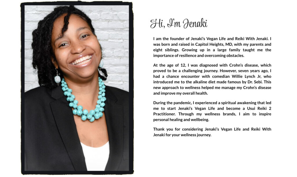
In this case study, let’s explore how Jenaki, a talented Reiki practitioner, and I collaborated to create a simple one-page WordPress website. I assisted Jenaki in securing a domain, selecting reliable hosting, writing compelling website copy, and integrating Square Appointments. This enabled her to establish an online presence, attract new clients, and streamline the booking process. Join us as we dive into the details of Jenaki’s transformative journey.
Client Background
During the pandemic, Jenaki experienced a spiritual awakening, leading her to establish Jenaki’s Vegan Life and become a Usui Reiki 2 Practitioner. Her mission focuses on inspiring personal healing and well-being.
The Journey
Jenaki approached me for a website and guidance on offering services to future Reiki clients. We had a 30-minute discovery call to discuss her needs, vision, and goals. After evaluating her requirements, I provided a detailed explanation, including a quote and an overview of what she needed to get started.
Domain & Hosting Process
We secured the domain jenakisveganlife.com as an umbrella for her brands. However, after further discussion, we also obtained Reikiwithjenaki.com since it would be her main focus for a while. Choosing WordPress as the platform, we secured hosting with Bluehost . While I handled the domain and hosting process, I assigned Jenaki tasks like writing her bio and acquiring a professional headshot for the website. I also provided her with a checklist for guidance
Create the Copy
Jenaki excelled at completing her tasks, and together we edited her bio. I extracted a few points from it to use as copy for her “work with me” section.

Jenaki’s goal was to market her Reiki services and provide an easy scheduling and payment process for clients. To achieve this, we opted to integrate Square for accepting payments and managing appointments. By embedding a Square booking widget, we made it effortless for clients to schedule and pay, saving time for both Jenaki and her clients.

Following a successful soft launch, Jenaki will soon be fully launching her website. Our next objective is to raise awareness and drive traffic to her site.

Conclusion
In conclusion, our partnership in creating a one-page WordPress website empowered Jenaki to establish a robust online presence and connect with clients seeking healing and self-discovery through Reiki. By leveraging my expertise in domain acquisition, website hosting, copywriting, and Square Appointments integration, I provided Jenaki with the necessary tools to expand her reach and enhance her business’s success. This journey shows the power of a simple well-crafted website in turning a passion into a thriving online enterprise.

by Olivia Moore | Mar 26, 2023 | blogging, Web Design, Web Solutions
Peace!
Have you ever landed on a website and left immediately because the content wasn’t quite what you were expecting? When it comes to your website, great content is super important. A website without content is just taking up space. In this post, I’m going to give you tips and tricks on how to create content that’ll make your visitors stay for more. Let’s get started.
Know Your Audience
First things first, you need to know who you’re creating content for. Are they millennials? Gen Z? Baby boomers? What are their interests? What are their pain points? What are they looking for? Understanding your audience is crucial for creating content that’ll resonate with them. So, do your research, ma’am! Check out social media platforms, forums, and surveys to get a better understanding of your audience.
Create Engaging Headlines
Your headline is the first thing your visitors will see, and trust me, first impressions are everything! So, make sure your headline is catchy and grabs attention. Use powerful words, questions, or numbers to make your headline stand out. And most importantly, make sure your headline is relevant to your content.
Tell a Story
People love stories! So, why not use storytelling to engage your audience? Share personal experiences, anecdotes, or case studies to make your content more relatable and memorable. But don’t just tell any story, make sure it’s relevant to your topic and provides value to your audience.
Keep it Simple and Clear
Ain’t nobody got time for complicated and confusing content! Keep your content simple and clear. Use short paragraphs, bullet points, and headings to make your content easy to read and digest. And most importantly, use plain language that your audience can understand.
Add Visuals
Visuals are everything! They not only make your content more appealing but also help to convey your message. You can use Canva to create graphics easily. Use images, videos, infographics, or GIFs to make your content more engaging and shareable.
End with a Call-to-Action
Last but not least, end your content with a call-to-action (CTA). A CTA tells your visitors what to do next, whether it’s subscribing to your newsletter, leaving a comment, or buying your product. Make your CTA clear, specific, and relevant to your content.
There you have it! Six tips on how to create great content for your website. Remember, creating great content takes time and effort, but it’s worth it. By following these tips, you’ll be able to create content that’ll make your visitors stay for more. Contact me if you need some help creating great content.

by Olivia Moore | Mar 9, 2023 | Web Design
Web hosting is one of the most important things you need when you are ready to get a website.
Now, if you’re new to website stuff, you might be asking yourself, “What the hell is web hosting?” Well, let me break it down for you in simple terms. Web hosting is basically like renting space on the internet to store your website files.
Think of it like getting an apartment. Just like you need a place to live, your website needs a place to “live” on the internet.
But why should you care? Well, just like with apartment hunting, you want to find a reliable and safe place to call home. Your web hosting provider is responsible for keeping your website up and running, making sure it’s accessible to visitors, and protecting it from hackers and malware.
So, how do you choose the right provider? Here are some considerations for choosing a web hosting provider:
Web hosting is an important part of your website’s success. Take the time to choose a reliable provider that meets your website’s needs. Schedule a discovery call when you are ready to choose or change your web host.

by Olivia Moore | Jan 12, 2023 | Web Design, Web Solutions
Over the past few years, I’ve had quite a few conversations with clients who originally thought they needed a traditional 5-page website. There is nothing wrong with having a 5-page website, but when you’re first starting out, it’s not necessary. There are many reasons why you might consider launching a one-page WordPress website. Here are just a few:
Simplicity
One-page websites are super simple, both to design and to navigate. Because the content is on a single page, there is no need to worry about creating content for multiple pages. This makes it much easier to get your site up and running quickly and also easy to make updates and changes as needed.
Focus
By limiting your site to a one-page website, you can focus on delivering clear messages to your visitors. This can be useful if you are launching a new product or service, or if you want to make a strong first impression.
Mobile-friendliness
One-page websites are super mobile-friendly, as all the content is displayed on a single page. This is a good thing if you want to reach a mobile audience, as more and more people are accessing the web from their phones and tablets.
Speed
Because there is only one page to load, one-page websites tend to be much faster than multi-page sites. This can be a huge plus for your visitors, as they won’t have to wait for multiple pages to load. It’s also really good for search engine optimization (SEO).
Here is an example of a one-page website I did for a client recently :

In conclusion, if you are looking to launch a simple, focused, mobile-friendly website that loads quickly, a one-page WordPress website might be the perfect solution for you. It doesn’t matter if you are a small business owner, a freelancer, or a creative professional, a one-page site can be a great way to get your message out to the world.
