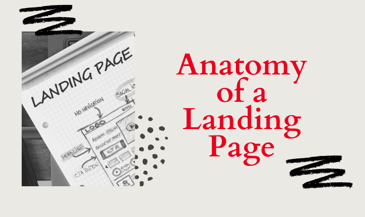
The anatomy of a Landing Page
-
Buy
-
Pre-Order
-
Book An Appointment
-
Sign-up
-
Subscribe
-
Read More
-
Learn More
-
Shop Now

We’ve discussed About Pages and the features every About page should have, so I thought it would be a great idea to give you some examples .
The first example that I love belongs to Les Brown

I love his about page because he has a great header that shows him in action and a motivational quote. He also has a well written bio and a very clear, quality image of himself.
Example #2 – Life Coach
The second about page that I like belongs to Tony Gaskins
Tony’s About page starts with a video followed by a bio and very clear picture. Take a look at the video he has embedded in his page.
Example #3 – Author/Consultant
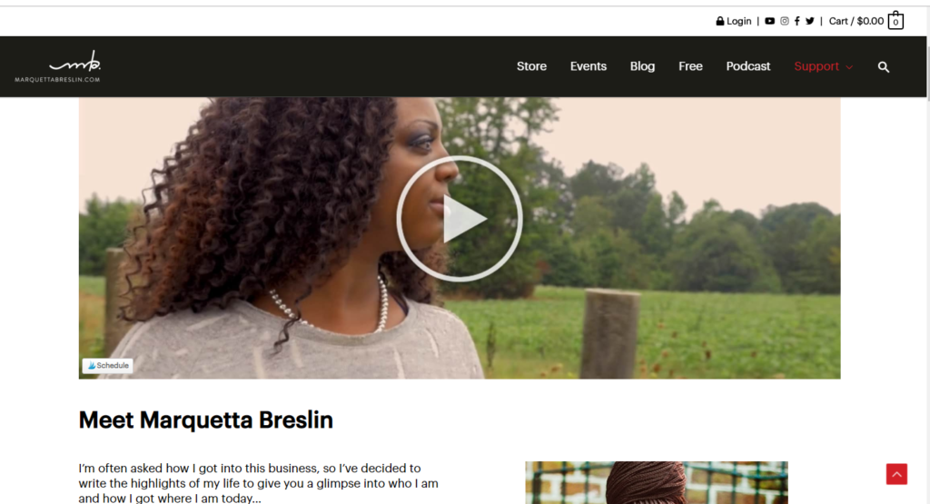
The final About page example belongs to Marquetta Breslin. I’ve been following her story for years now and purchased a few of her products during my career as a natural hair stylist. Her about page is her story! She talks about who she is , why she is , and what to expect. One of my favorite books that I have in my collection is Million Dollar Stylist: The Hair Stylist’s Roadmap to Financial Freedom, Building the Business of Your Dreams, and Doing What You Love!
Designing an About page doesn’t have to be complicated. So don’t overthink and keep it simple, and concise. I hope that these examples help you get more clarity on how to design your about page.
Need help creating your about page or another part of your website? Let’s set up some time to chat.
About pages are the perfect opportunity to give people a deeper look into you and your business. Why not take the time to make the best of the opportunity. So what should you include on your about page? Today, i’m going to share 9 features you should have on your about page.
What’s your company/brand’s story? why do you do what you do? This is an opportunity to tell your brand’s story.How was your company founded? How did you come up with the name ? What is unique about the product or service you offer?. Try to keep the narrative simple, but engaging.
What makes your business stand out from your competitors? For some it’s great customer service. For other’s it’s quick and efficient solutions, or budget friendly quality products. Whatever the case may be , make sure you include it on your about page.
Do you have a mission or vision statement? You can include it as well as overall company info on this page.
Your about page doesn’t have to be just about you or the company, but it’s a great way to introduce your team mates. Make sure everyone has a quality photo as well as their bio information . You could even include their social media handles.
There are many other features you could include, but these will give you a good foundation to build upon.
Need help creating your homepage or another part of your website? Let’s set up some time to chat.
We’ve discussed home pages and the features every Home page should have, so I thought it would be a great idea to give you some examples .
The first example that I love belongs to Nesha Woolery of https://neshawoolery.com/
I love her homepage because it’s simple, clean , and without scrolling , you know exactly what she offers. She also has 2 call to actions right away. Looking at her page, you can get a clear sense of what she offers and who she works with.
The second example belongs to Marie Forleo. My favorite part of her home page is the about section. It’s clear and straight to the point. She also has a call to action that scrolls with the page and is always visible. ( GET YOUR COPY!)
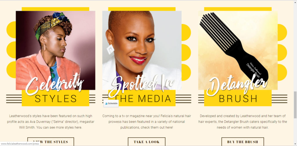
The third home page example belongs to Celebrity hairstylist Felicia Leatherwood. I love that you can check out her gallery, check out places she’s been featured, or buy her detangler brush…which is a miracle worker!
Designing a homepage doesn’t have to be complicated. So don’t overthink and keep it simple, and concise. I hope that these examples help you get more clarity on how to design your home page.
Need help creating your homepage or another part of your website? Let’s set up some time to chat.
Every time someone takes a business card or finds you on social media, there’ s an opportunity for someone to take a look at your website.
Whenever a new person lands on your website homepage, people are critiquing what they see, forming an opinion of you, and determining if you’re worth getting to know further, and doing business with.
Have you sat and really thought about what you’re going to put on your homepage?
In this article, we’ll share 9 key elements every homepage should have to help make sure that you are prepared when you launch your new site.
Navigating your site should be simple and straight to the point.You want your clients/customers to arrive on your website know what to do and know exactly where they can find the information they want and need without being confused.
You need a clear, concise summary of what you offer. Tell your visitors exactly what you do with a clear, easy-to-find value proposition.I typically place this in the top part of the site. If people don’t have an understanding of what your company does, who it does it for, and how it does it differently, they are not likely to stick around to find out. Here is my CVP:
You want to give people other places to interact and engage with you outside of your site. You can place your links either at the top of your homepage or in the footer, or maybe even a sidebar.
What do you want your customers to do first when they land on your site? Join your email list, schedule a call, or maybe purchase a product. Make it easy for your customers to take action .
Let your clients and customers know that you’re not just patting yourself on the back. Let your testimonials speak. It’s the perfect way to build trust and lets people know they can feel confident in choosing you.
What do you offer?Write the vision and make it plain. A simple list of services helps paint the picture. If you are a hairstylist or make-up artist, this is a great opportunity to list specific services that you offer.
Give your clients the opportunity to contact you easily if they have questions . I prefer to add a link to the contact page or include a contact form in the footer.
Your blog is an opportunity to show your expertise and helpfulness and offers people the opportunity to start a relationship with your brand. You could add a your top blogs or simply included a live feed of your most recent posts.
If you’re just getting started, you may not have quality pictures of your own. You can find great stock photos on Pixabay or unsplash. Stock photos are great to use temporarily , but at some point you want to invest in high quality images of you and your business. Bad quality pictures can be distracting.
Need help creating your homepage or another part of your website? Let’s set up some time to chat.